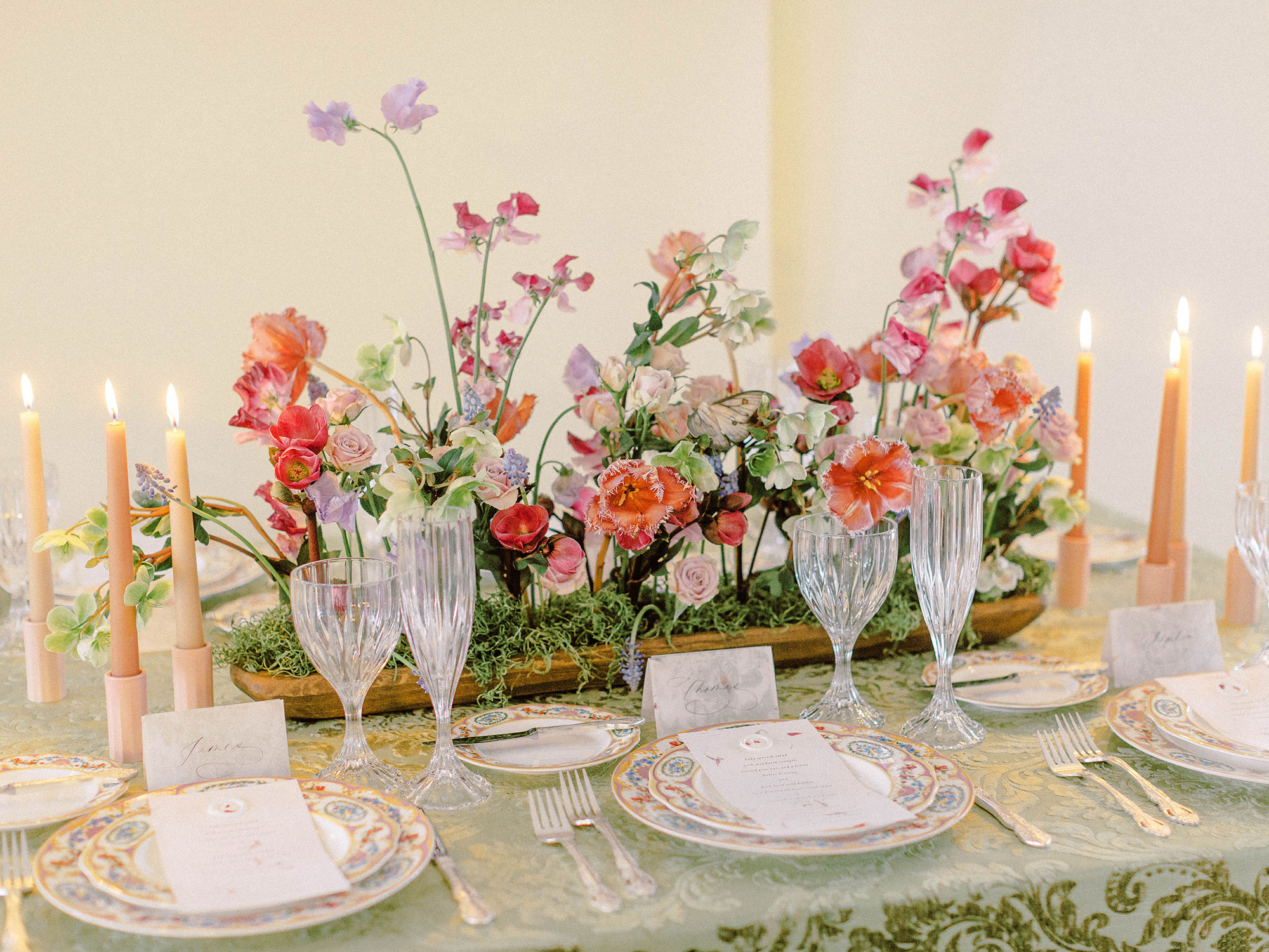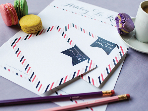

Happy Monday, bloggies! In celebration of Lemon and Lavender’s incredible relaunch tonight I thought I’d write a bit about styling paper products for photos, whether it be a wedding planner doing so for a client or a designer updating their portfolio. I often get questions from photographers on how they can make this process easier at weddings when there isn’t a planner or stylist on hand to help wth the arranging of these items. I personally love artfully arranging client’s stationery to reflect their wedding and personal style and always try my best to make sure my brides save me a set to play with on the big day. So join me and read along as I share some of my fave tips below and fave photos that I helped style for the sweet and talented, Ashley!
{Lighting} It’s pretty obvious but natural light produces the cleanest photos. Taking photos by a large window or even outdoors in natural light (but not overly bright or directly overhead sunshine!) usually results in the cleanest most consistent images. I typically ask photographers to direct me to a spot where I can lay everything out since they know what lighting conditions work best with their style, but lighting has a huge impact on the final product. Colors in the shot look truer, the quality of the paper product like the paper itself or the type of printing used (letterpress, embossing, etc) shows up better and other details used in the photos just look better when the lighting is right. You can never go wrong when the lighting is right.
{Details} Aside from the paper suite itself, like the invitation, response card, envelope and other inserts, it’s nice to include details that relate to the wedding or the couple in the laid out shot. For example, a Christmas themed wedding invitation suite all laid out may include a sprig of mistletoe or a strand of a thick cut shimmery ribbon. Or perhaps the vintage loving bride whose getting married at her Grandparent’s estate, may have one of Grandma’s brooches to lend for the shot. In the photo above, I used a red apple and leaf from an apple tree, plus a rustic wood backdrop to compliment the apple orchard themed wedding that one of Ashley’s couples put together. The great thing is this whole look went perfectly with the couple’s wedding photos!
{Positioning} Placement of each item is crucial in creating an aesthetically pleasing shot. It’s pretty logical but think of it this way; when you arrange your decorative throw pillows on your bed or everything on your kitchen table in preparation for a family dinner, you usually do so in a way that makes sense and visually looks, well good, right? Styling paper products works the exact same way. If an invitation suite is more formal with an envelope displaying gorgeous vintage stamps and hand calligraphy, perhaps the image will look best with just the invite and envelope in it and maybe a small bloom from one of the centerpieces. Simplicity is key especially since the purpose of the shot is often to let the actual paper product shine on its own.
I couldn’t be more thrilled to share some of the gorgeous photos above taken by Kelly Braman Photography for Ashley’s new site and official relaunch. You can check out the new site here where more of Ashley’s work and designs can be found. And if anyone has any other suggestions or tips for creating gorgeous photos of paper products and collateral, please do leave them below! In the meantime I’m off until Thursday here in the Windy City with this girl, this one and this one too, celebrating our journey with Making Things Happen. Wheeee! I will be back with more goodies soon. Enjoy your day, beauties xoxo